Friday, February 8, 2013

Kelp Forest


I drew several nearly full size sketches, some with 'cute' seals and jelly fish,
but ultimately decided that I just loved the dreamy quality of the kelp.


After I finished the design on newsprint, I scribbled graphite on the back of the paper to
create 'feaux carbon paper'.
'.
I transfered the design to a block of 140# Arches cold pressed watercolor paper.


After the design was transfered it was pretty spotty, so I redrew all the lines with a #2 pencil.


I used Winsor & Newton resist to reserve the portion of the painting that would be oranges and golds. 
I taped off the paper so the area I would be painting was 1" bigger in each direction than the finished size.


I mixed large puddles of the blues, greens, and golds that I will use for the initial wash. 
I got the paper really wet, then mopped up the puddles.

Here is the first wash - very juicy and soft.


After the second layer of washes I removed the resist and mixed puddles of the colors for the next kelp.


I tested the colors together in the margin of the paper to ensure that they were harmonious
with each other and with the colors already on the paper.


Here I have finished all the watercolor painting and will begin adding pastel to give more
definition and interest to some of the kelp.
 

Here is the finished piece - the photograph doesn't do it justice, please come to the annual
fundraising dinner for Feiro Marine Center to see "Kelp Forest" in person.
Posted by Picasa

Tuesday, January 1, 2013

Grandma's Sugar Spoon


I started by taking dozens of photographs of my still life components which I studied in Picasa. 

Then I rearranged the components and took lots more photos from every angle with the lighting coming from different angles.  It took a couple of hours, but by the time I chose my cropped reference photo  I was confident that I had a good design.

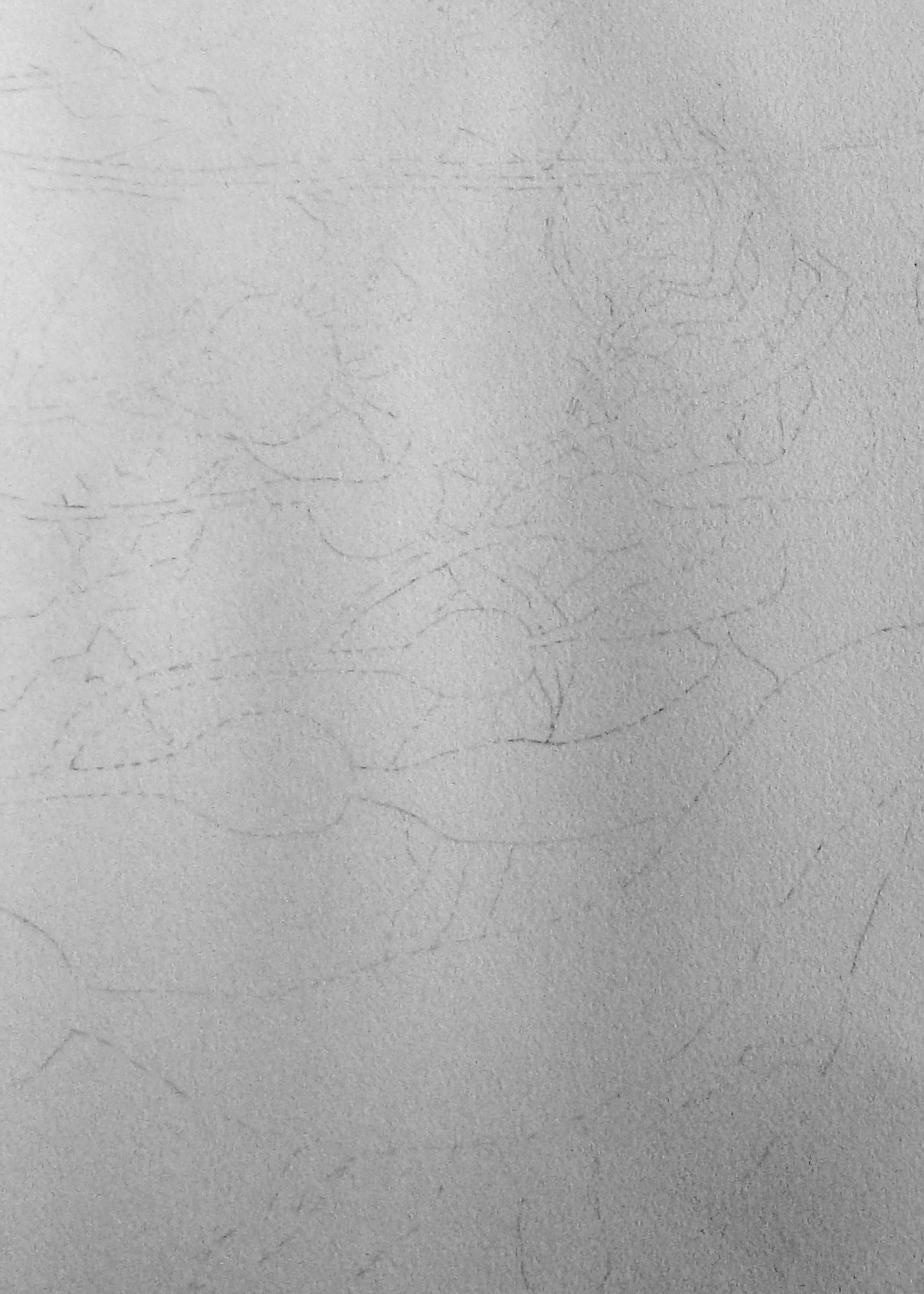
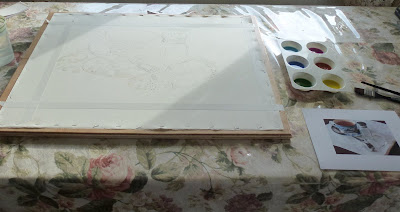
Next I made a detailed drawing on a full sheet of  stretched 140# Jack Richeson watercolor paper.  I taped off the edges to define the picture size and proportions and to leave a clean edge for the framer.

I reserved the whites and lightest lights with resist and while that was drying, I mixed large reservoirs of the initial washes in my white plastic muffin pans. 


I got the whole paper very wet and waited for the sheen to disappear before sloshing on the wet in wet washes with a 1" flat brush.  Such fun! 


Sadly, even though I had stretched the paper, it buckled quite a lot and the horizontal swales made a couple of color mixing decisions for me, but the effect wasn't too bad so I just went along with the paper's plan.  


After the initial wash was dry I used more resist to reserve some areas of the light washes especially in the fabric and glass of the salt shakers.


After those washes were thoroughly dry I wet the entire paper again with clear water and began dropping in mid value washes.


To key the painting (set the darkest and lightest values) I added a very dark area in the foreground.


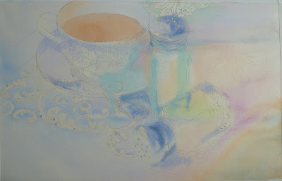
Here is the painting just before I removed all the layers of resist.

This was a good time to walk away from the painting so I could see it with 'fresh eyes' in the morning.


The next morning I realized there was too much contrast in the fabric so I toned it down with very light neutral washes. Then,  to add contrast in the center of interest, I darkened some of the dark areas and used my magic eraser to reclaim a few of the white sparkles.

The more I paint, the more confident I am and the more fun the project is...go figure!


About a week later, I decided to add the dark wood of the table to anchor the fabric in place so the objects didn't appear to just be floating in space.  I 'calmed down' the eye catching designs in the fabric even more by once again painting large neutralizing washes (e.g., pale orange over blue).  The fabric is fun, but it was not intended to be the major player in this painting; and since it kept catching my attention more than my chosen center of interest (the spoon) I knew it needed to be softened and 'pushed back'.  Finally I realized that the fabric looked too flat so I again got the entire fabric area wet with clear water and added very soft fold shadows especially in the foreground.

I had received some good criticism from a friend who noticed that the ellipses in the teacup were 'off'...
I was able to correct both the cup and the liquid in the cup (liquid always needs to appear level) by lifting paint in some areas and adding paint in other areas.

                                    Note to self : check the symmetry of shapes before painting!

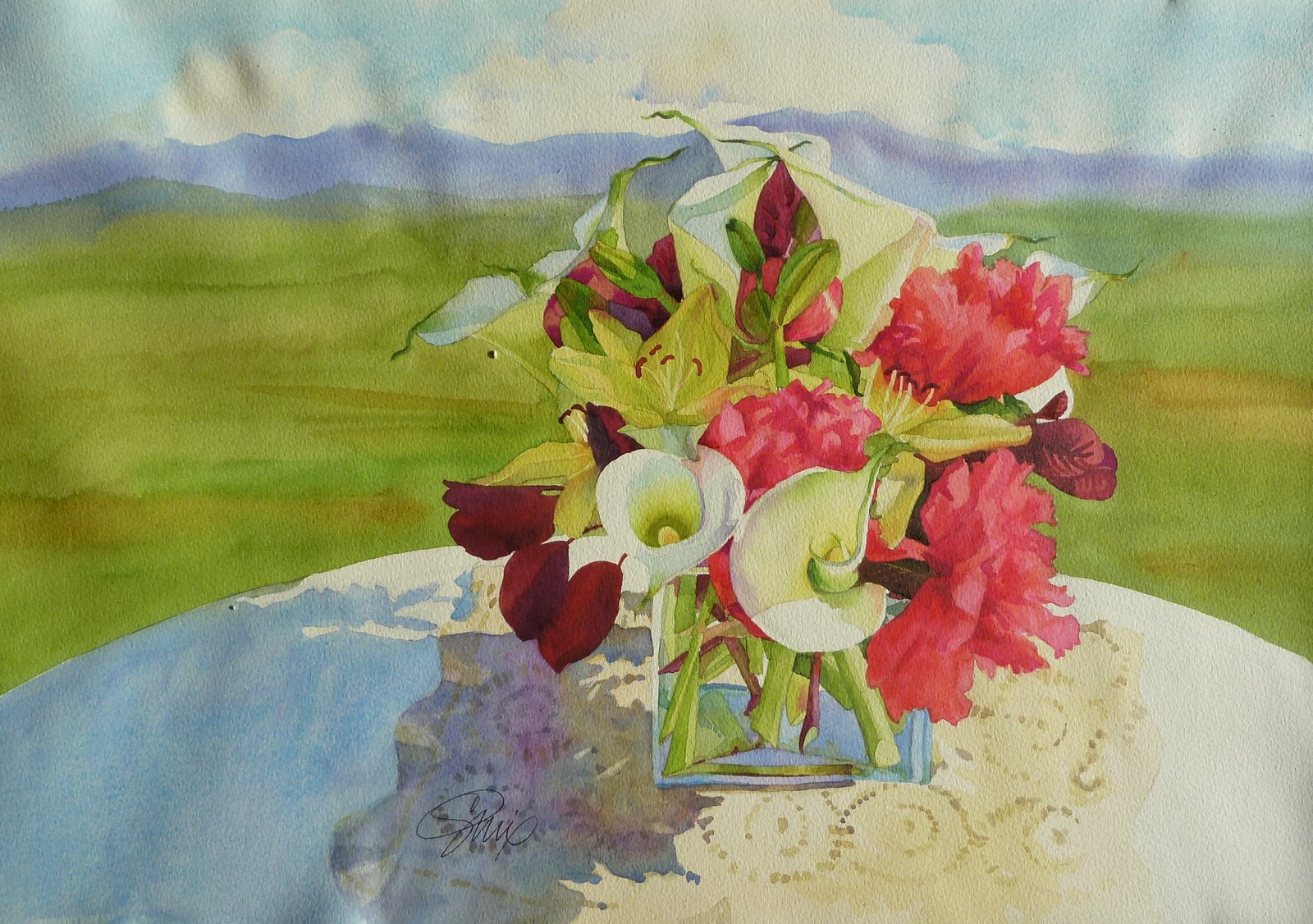
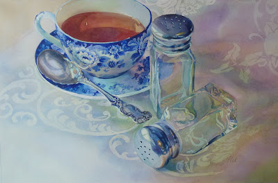
So here's the finished piece at last; click on the image and you will see a larger version of it.  My sister Chris has 'dibs' on this painting, but I will have prints and cards available at my open studio this summer July 19-21.  And I will paint many more evocative pieces this winter, so stay tuned!  Catherine

I have a few more openings in my Introduction to Watercolor class that will start on Tuesday February 12th at 1 pm here at the Cutting Garden in Sequim, WA so if you are interested, please email me at catherine@cuttinggarden.com and I'll send you the materials list and the particulars.

Please leave a comment!


Grandma's Sugar Spoon
24" x 15.5"
original watercolor by
Catherine Mix

Posted by Picasa

Thursday, December 20, 2012

Calla Lilies and Peonies


Starting with a line drawing, I masked out the areas that were to remain light or white.  I also use the mask to act like a dam between colors like the lavender mountains and the white calla lilies.

The first washes are light; I think of them as place holders and use this first layer to tie things together.


Secondary washes begin to add the mid value shapes.


I have underpainted the pink peonies with a warm orange to make them warmer and more
harmonious with the predominant yellows and greens in the piece.

Finally the darkest darks and the details.  Sorry that the sidelight I used from the window for this last photograph shows the undulations of the paper....I did stretch it, but some of the staples hold more firmly than others so I get a little pucker action which I will iron out later.
Posted by Picasa

Tuesday, December 18, 2012

Red Barn in Sequim at sunrise and Painting Shiny Things


This is the loose wet in wet watercolor under painting; the white areas are masking fluid
which both act as a dam between wet colors and reserving white and light areas for later.


This is a lovely 'old style' barn in Sequim; it's being remodled into either a shop or a home and I wanted to paint it before it was too 'fixed up'.   I love this place - I hope it shows in my work!


After taking Paul Jackson's workshop, I feel my watercolor painting has jumped ahead.  His hints and tips showed us that there is no reason to fear watercolor - almost everything can be corrected....thanks Paul!
Posted by Picasa

Saturday, November 24, 2012

Painting Glass and Shiny things


I just got back from a 4 day workshop taught by Paul Jackson at Ladyslipper
Studios in Sidney on Vancouver Island.  I couldn't wait to set up a
small still life and try out the techniques I learned.  Above is my reference
photo and below is the photo in black and white to help me judge values.


After masking out the whitest sparkles I laid in the first very light wash.


Then I masked out the leaves and tendrils woven into the damask cloth.


The next wash was somewhat darker and I made sure to move from green to lavender for interest.

 I decided to tackle the main colors of the stem next so I could mask it out while
I painted the body of the glass pumpkin.  I laid in the first wash of the cast shadow of the pumpkin.


After I masked out portions of the stem that were touching the pumpkin, I made
the first pass of the blues, violet, yellow, and green in the pumpkin.  I am using a watercolor paper that I am not comfortable with and feel I would have had a better, looser effect with Arches 140# paper.  I made a second pass at the cast shadow of the pumpkin and laid in some of the blue patches in the candlestick.
 
 
At this point I removed all the masking and began to add the dark details
to the candlestick, pumpkin stem, and pumpkin. 

I washed over the entire fabric area to soften the fabric details so they would recede more. 

Finally I peeled off the tape and signed my name, the 5" x 7" painting took about 6 hours start to finish and I created it especially for our upcoming Sequim Arts Small Works Show which opens at the
Museum and Art Center beginning on December 5th (I think). 
I hope you get a chance to come to the show!!
 
Posted by Picasa

Friday, November 2, 2012

PASTEL LESSON: CLEAR GLASS BOTTLE ON A REFLECTIVE SURFACE (300# WATERCOLOR PAPER)

 Here's the still life lit with one light.


A quick sketch with a #2 pencil.


I toned the paper with a warm, mid-value wash of watercolor in a reddish
color which will sparkle through the cool pastel colors I will use.


The initial pastel layers are loose and done with a hard pastel.


I key the painting by applying the light value that is the blue glass. 


I concentrate on adding the mid values, including glazing colors from the
background over the bottle that was too light.


The last step is to add the details in the lightest lights and the darkest darks. 
Three things fool us into thinking the bottle is glass; the sparkle, the
squiggle (distorted objects seen through the glass) and painting the background
through the shape so we feel we are seeing the background through the glass.
 
Posted by Picasa